Top 5 Qs about an Unfairly Rarely Used Graph for Single-Case Designs
Last updated: Jan 17, 2023
My name is Rumen Manolov, I am a Psychologist working at the University of Barcelona and focusing on research methodology and statistics. I got involved in the SCED context thanks to my mentor Prof. Antonio Solanas and I also have had the privilege to work with Prof. Patrick Onghena from KU Leuven. Both have helped me discover a previously hidden world presenting multiple challenges, in terms of data analysis, and ever more potentially useful solutions that need to be explored.
In the current post, I would like to refer to a graphical representation, considering the importance of visual analysis in SCED research. However, this graphical representation is not the typical line graph representing measurement occasions on the abscissa and raw data in the ordinate. It is rather a graph that allows representing multiple replications of the “basic effect”, which is observed when a baseline condition is compared to an intervention condition. Actually, a similar kind of plot has been used for meta-analytical purposes, under the name “L’Abbé plot” (https://doi.org/10.1002/jrsm.6). Thus, the current plot aims to promote a not very frequently used plot in the SCED context, but a plot that can be very useful, by combining concepts from research synthesis (and meta-analysis) and the necessary replication for SCED studies.
The example data I will use refer to the application of constraint-induced movement therapy to increase motor behaviors per hour-long observational session, for a child with hemiplegic cerebral palsy (see https://content.iospress.com/articles/neurorehabilitation/nre00469). An ABAB design, replicated across three behaviors, is used.
1. Is there anything else apart from the time-series line graph?
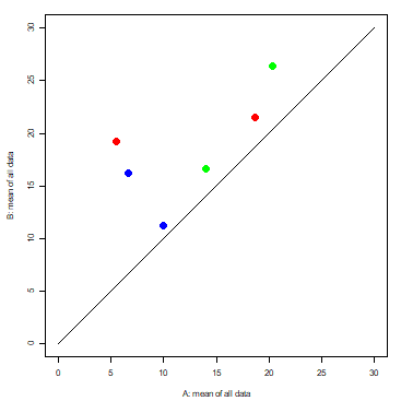
Yes, there is; a graphical representation of phase means (A, baseline vs. B, intervention) called a “modified Brinley plot” (Blampied, 2017: https://doi.org/10.1016/j.beth.2016.09.002). Each dot represents an A-B comparison, and different dots can belong to the same or to different participants. In the original or standard Brinley plot the dots could belong also to group means or two individual pre-test and post-test measures, rather than to individual means obtained on the basis of several measurements. The coordinates of each dot are defined by the mean of the baseline phase (for the X-axis or abscissa) and the mean of the intervention phase (for the Y-axis or ordinate). There is a diagonal line, which has an intercept equal to 0 and a slope coefficient equal to 1. This diagonal line represents the equivalence between baseline and intervention (e.g., no difference).
For instance, Figure 1 illustrates two A-B comparisons for each of three motor behaviors (shown as different colors) of a child with hemiplegic cerebral palsy.

Figure 1. A-B comparisons on the modified Brinley plot
2. How can we visually summarize whether there is an improvement for all A-B comparisons (e.g., participants)?
If the improvement is an increase, then all dots should be above the diagonal line. If the improvement is a reduction, then all dots should be below the diagonal line. In Figure 1, all six comparisons are above the diagonal line, which suggests an improvement during the intervention phase (i.e., more motor behaviors).
3. How can we assess whether the improvement is similar / consistent across A-B comparisons?
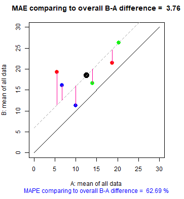
We can draw a line, parallel to the main diagonal line. Its intercept would be equal to the average difference between the means of the intervention phase and the baseline phase. The slope of this additional diagonal line is equal 1 and it has no specific meaning. The closer that the dots are to this second diagonal line, the more similar or consistent the mean differences are for each A-B comparison to the overall mean difference. For instance, see Figure 2, according to which the typical (i.e., average) difference between each mean difference and the overall mean difference is 3.76 motor behaviors, which represents 63% of the overall mean difference (5.99).

Figure 2. Extension of the modified Brinley plot for assessing the consistency of effects.
4. How can we assess whether the effect of the intervention is sufficient (for all A-B comparisons)?
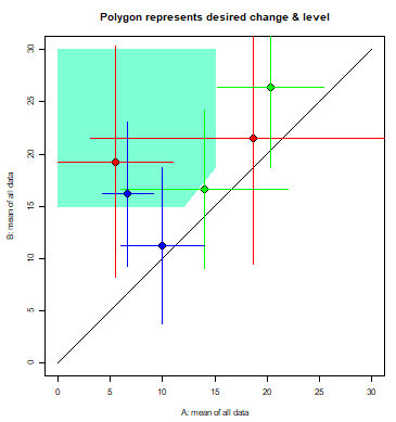
Before carrying out an intervention, we can represent a polygon on the Brinley plot which would be a visual indication of a “sufficient effect”. The effect is deemed to be sufficient if it achieves (a) the desired amount of change (e.g., a 25% increase in motor behaviors per hour-long observational session, for a child with hemiplegic cerebral palsy), and (b) the desired post-intervention level (e.g., a minimum of 15 motor behaviors per hour-long observational session).
After completing our intervention, we check how many of the dots are within the polygon, that is, how many show a sufficient effect that is replicated across A-B comparisons. For instance, see Figure 3, for which most effects are not included in the polygon and also the phase means badly represent the data, as marked by the large vertical and horizontal error bars (which are based on the mean absolute deviation of the raw measurements around the within-phase means). Finally, we can look for reasons why some effects are not replicated.

Figure 3. Polygon for assessing replication of sufficient effect
5. Can we obtain these graphical representations automatically and for free?
Yes, from https://manolov.shinyapps.io/Brinley/. It is only necessary to prepare a data file, as illustrated in the website, specify the aim of the intervention (increase or reduce target behavior), specify the desired amount of change and the desired post-intervention phase level (e.g., cut-off point), and the minimal and maximal value for the axes of the Brinley plot.
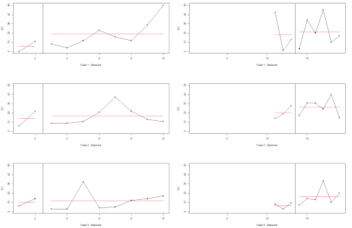
By the way, I am not recommending the use of the modified Brinley plot without looking at the time-series line graph. So, in case you are curious about the raw data (and you should be!), have a look at Figure 4, obtained from the same website mentioned before.

Figure 4. Raw measurements for each of the three behaviors
- Anzures‐Cabrera, J., & Higgins, J. P. (2010). Graphical displays for meta‐analysis: an overview with suggestions for practice. Research Synthesis Methods, 1(1), 66-80. https://doi.org/10.1002/jrsm.6
- Blampied, N. M. (2017). Analyzing therapeutic change using modified Brinley plots: History, construction, and interpretation. Behavior Therapy, 48(1), 115–127. https://doi.org/10.1016/j.beth.2016.09.002
- Manolov, R., & Tanious, R. (2020). Assessing consistency in single-case data features using modified Brinley plots. Behavior Modification. Advance online publication. https://doi.org/10.1177/0145445520982969
- Manolov, R., Tanious, R., & Fernández-Castilla, B. (2021). A proposal for the assessment of replication of effects in single-case experimental designs. https://psyarxiv.com/byzfd/
