Coronavirus, Telemedicine, and Race: Simulated Real-World Evidence

Photo of the author’s glassboard.
Introduction
We would overstate our telemedicine app’s effectiveness by claiming it reduces the risk of new coronavirus infections by 16.9%—when in fact it will only reduce this risk by 3.1%.
Consider a timely hypothetical twist on a classic example of spurious correlation: Recently, ice cream sales have been dropping—along with the number of homicides. But this isn’t because eating ice cream drives people to murder. It’s because a community-wide shelter-in-place mandate was enacted to prevent the spread of a novel infectious agent. This confounding factor drove down both ice cream sales and the number of homicides; hence the spurious correlation.
In this two-part tutorial, we’ll investigate a synthetic dataset inspired by a recent healthcare example involving racial disparities in COVID-19 cases (Garg et al, 2020; Aubrey, 2020). (Synthetic data are simulated—not real—data commonly created to teach or learn about an analytical tool.) We’ll follow a typical data science analysis workflow.
Our analysis goal will be to help public health authorities in our simulated world reduce SARS-CoV-2 (“coronavirus”) infections. We believe our digital health or telemedicine app can help prevent new infections; e.g., by promoting healthy lifestyle choices—particularly while social distancing and sheltering-in-place—that reduce the risk of coronavirus infection. But to do this, we’ll need an unbiased or statistically consistent (i.e., more unbiased with larger samples) estimate of the true effect of our would-be intervention.
Tutorial Goal: To understand how causal assumptions change our interpretation of predictions, moving them towards explanations. To understand why this is needed before we can quantify the impact of our tech solution.
What We’ll Learn: How to recognize the difference between a modeling association and a causal effect. How to conduct causal inference via the g-formula (Robins, 1986; Hernán and Robins, 2006) and propensity score weighting (Rosenbaum and Rubin, 1983; Hirano and Imbens, 2001; Lunceford and Davidian, 2004).
We will learn how a confounder biases our estimate of the would-be effect of a hypothetical telemedicine intervention. The biases that emerge from our synthetic data are shown below.
| Part | Study Design | Confounder Adjustment | Empirical Bias | Estimated Risk Reduction |
|---|---|---|---|---|
| 1 | RWE (observational study) | not done | -0.138 | overstated |
| 2 | RCT (experimental study) | not done | -0.003 | consistently estimated |
| 2 | RWE (observational study) | g-formula | 0.008 | consistently estimated |
| 2 | RWE (observational study) | propensity score weighting | 0.010 | consistently estimated |
In Part 1, we’ll analyze synthetic real-world evidence (RWE) data. We’ll begin to see why it isn’t enough, in general, to state the causal mechanisms (e.g., directed acyclic graph) and control for all confounders—assuming we observe all of them in our dataset. We must go one critical step further in order to estimate an intervention’s true effect size and direction. This step uses the Law of Total Expectation, a straightforward and intuitive concept we actually use all the time, that we’ll review in Part 2.
We’ll conclude in Part 2 by analyzing data from a synthetic randomized controlled trial (RCT) in which we’d randomly assigned the app to 50% of all trial participants. We’ll learn how to use the Law of Total Expectation to conduct causal inference using observational RWE data. (In both the RWE and RCT, the app had the same average effect on infection risk regardless of other causes; i.e., there was no interaction of app usage with other causes.) Specifically, we’ll learn how to apply the g-formula (also called “standardization”) and propensity score weighting to estimate the true overall or average treatment effect (ATE).
Here in Part 1, we’ll analyze a synthetic RWE dataset with three person-level variables: infection status, app usage, and race (Black or White only for simplicity).
Part 1 Objective: To try—and fail—to estimate the ATE of app usage on infections. We’ll specify the ATE as the difference in infection risk, or risk difference (RD); specifically, as the risk among users minus that among non-users.
What We’ll Learn: How to recognize the difference between a statistical contrast (e.g., RD) and a causal effect. Estimating the ATE incorrectly by confusing the former for the latter has far-reaching public health implications.
We will conclude Part 1 with the key insight that if we mistakenly infer causation from correlation:
We would overstate our telemedicine app’s effectiveness by claiming it reduces the risk of new coronavirus infections by 16.9%—when in fact it will only reduce this risk by 3.1%.
Dataset Characteristics
The observed (i.e., non-randomized) RWE data are in the tibble observational_rwe. (Generate this with the R code in the Appendix.)
glimpse(observational_rwe)## Observations: 80,000
## Variables: 3
## $ race <chr> "White", "White", "Black", "White", "White", "White", "Whit…
## $ app <chr> "used app", "used app", "didn't use app", "used app", "used…
## $ infection <chr> "1. infected", "0. uninfected", "0. uninfected", "0. uninfe…Each observation (i.e., row) represents a unique individual who was originally susceptible and uninfected. The variables and their unique values are:
knitr::kable(apply(observational_rwe, 2, unique))| race | app | infection |
|---|---|---|
| White | used app | 1. infected |
| Black | didn’t use app | 0. uninfected |
Let’s randomly split the data into an 80% training set for exploratory data analysis (EDA), and a 20% holdout set for fitting an explanatory model (Shmueli, 2010) in our final validation/confirmatory analysis.
holdout_proportion <- 0.2
observational_rwe <- observational_rwe %>% dplyr::mutate(rownum = row_number())
set.seed(2004120322)
observational_rwe_training <- observational_rwe %>% dplyr::sample_frac(1 - holdout_proportion)
observational_rwe_holdout <- observational_rwe %>% dplyr::filter(!(rownum %in%
  observational_rwe_training$rownum))

# clean up: remove rownum
observational_rwe$rownum <- NULL
observational_rwe_training$rownum <- NULL
observational_rwe_holdout$rownum <- NULL
There are 64000 training observations and 16000 holdout observations.
Exploratory Data Analysis
Univariate Associations
Correlation Matrix
dummy_rwe_training <- observational_rwe_training %>%
  dplyr::mutate(
    race = (race == "White"),
    app = (app == "used app"),
    infection = (infection == "1. infected")
  )
knitr::kable(round(cor(dummy_rwe_training), 4))| race | app | infection | |
|---|---|---|---|
| race | 1.0000 | 0.5294 | -0.3553 |
| app | 0.5294 | 1.0000 | -0.2239 |
| infection | -0.3553 | -0.2239 | 1.0000 |
corrplot::corrplot.mixed(cor(dummy_rwe_training))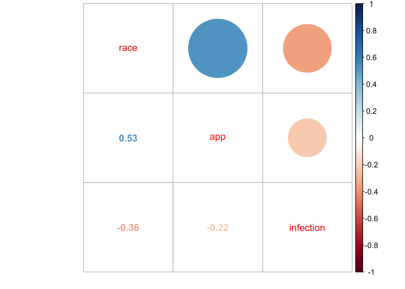
Even in this simple correlation matrix, there are already signs of the challenges ahead. Can you spot them?
Infections by App Usage (Marginal Model)
Let’s examine our main relationship of interest.
observational_rwe_training %>%
  ggplot2::ggplot(ggplot2::aes(x = app, fill = infection)) +
  ggplot2::theme_classic() +
  ggplot2::geom_bar(position = "dodge") +
  ggplot2::ggtitle("Infections by App Usage")
df_rwe_training <- with(
  observational_rwe_training,
  cbind(
    table(app, infection),
    prop.table(table(app, infection), margin = 1) # row proportions
  )
)
knitr::kable(df_rwe_training) # row proportions| 0. uninfected | 1. infected | 0. uninfected | 1. infected | |
|---|---|---|---|---|
| didn’t use app | 9519 | 3653 | 0.7226693 | 0.2773307 |
| used app | 46187 | 4641 | 0.9086921 | 0.0913079 |
There was a lower infection rate (i.e., empirical or observed infection risk) among app users: Only 9.1% of users had infections, compared to 27.7% of non-users. The empirical RD is 0.091 0.277 -0.186—a marginal quantity in statistical terms because it does not account for (i.e., “is marginalized over”) any other variables. A model that does account for other variables (here, race) in addition to the would-be intervention (here, app usage) is called a conditional model.
out_fisher_rwe_training <- with(
  observational_rwe_training,
  fisher.test(app, infection)
)out_fisher_rwe_training##
## Fisher's Exact Test for Count Data
##
## data: app and infection
## p-value < 2.2e-16
## alternative hypothesis: true odds ratio is not equal to 1
## 95 percent confidence interval:
## 0.2493633 0.2749802
## sample estimates:
## odds ratio
## 0.2618449In addition, there is strong statistical evidence (i.e., statistical significance) that infections varied by app usage ( 0.001). Here, the estimated odds of infection for app users were only 0.262 (i.e., roughly a quarter) that of non-users, with an EDA 95% confidence interval (CI) of (0.249, 0.275).
Statistical significance does not imply importance: This strong statistical evidence is not surprising. Bigger samples typical of RWE data provide better estimates of progressively smaller differences in outcome means (i.e., for any given set of outcome distributions with finite means and variances). This says nothing about the domain (e.g., scientific, clinical, research, business) usefulness of those differences.
Correlation does not imply causation: In no way does this finding imply that using the app reduces infection risk. Statistical findings like this cannot imply causation. Statistical findings are implications of causal relationships, not vice versa. But it should prompt us to investigate further, and should be assessed alongside subsequent findings and hypotheses to help explain how this association arose.
Infections by Race
Race seems to have been associated with infection.
observational_rwe_training %>%
  ggplot2::ggplot(ggplot2::aes(x = race, fill = infection)) +
  ggplot2::theme_classic() +
  ggplot2::geom_bar(position = "dodge") +
  ggplot2::ggtitle("Infections by Race")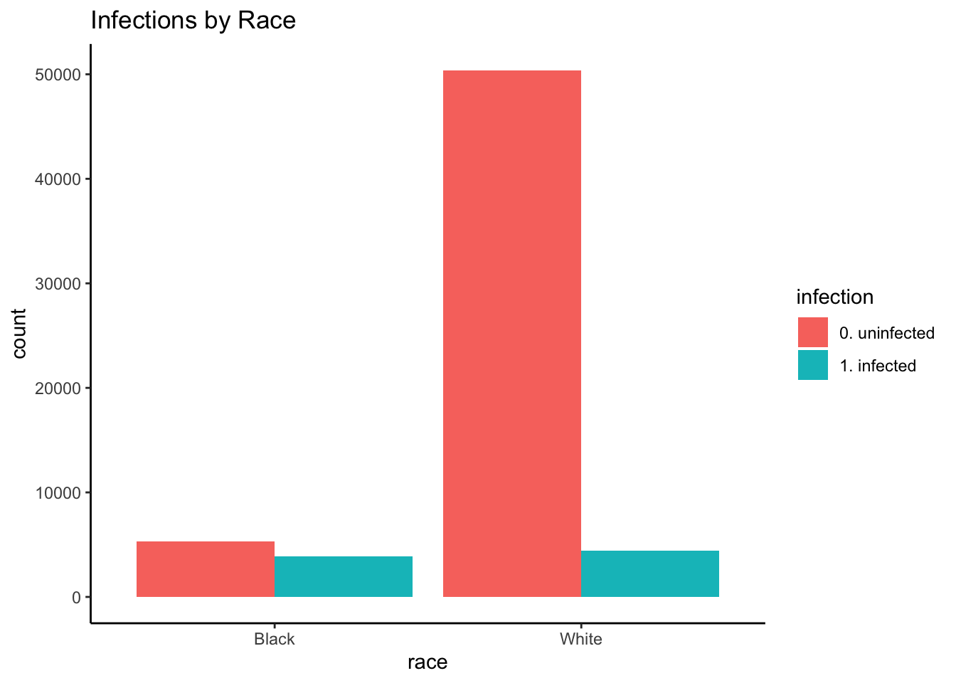
df_rwe_training_race_infection <- with(
  observational_rwe_training,
  cbind(
    table(race, infection),
    prop.table(table(race, infection), margin = 1) # row proportions
  )
)
knitr::kable(df_rwe_training_race_infection) # row proportions| 0. uninfected | 1. infected | 0. uninfected | 1. infected | |
|---|---|---|---|---|
| Black | 5327 | 3871 | 0.5791476 | 0.4208524 |
| White | 50379 | 4423 | 0.9192913 | 0.0807087 |
out_fisher_rwe_training_race_infection <- with(
  observational_rwe_training,
  fisher.test(race, infection)
)out_fisher_rwe_training_race_infection##
## Fisher's Exact Test for Count Data
##
## data: race and infection
## p-value < 2.2e-16
## alternative hypothesis: true odds ratio is not equal to 1
## 95 percent confidence interval:
## 0.1147125 0.1272759
## sample estimates:
## odds ratio
## 0.1208232Blacks were more likely to have been infected than Whites ( 0.001): 42.1% of Blacks were infected, compared to 8.1% of Whites. Put differently, the estimated odds of infection for Whites were 0.121 (95% : 0.115, 0.127) times that of Blacks. This finding is plausible due to structural inequality: African Americans tend to have worse access to care, lower socioeconomic status (SES), and more underlying health conditions.
App Usage by Race
Importantly, it looks like race was strongly associated with app usage.
observational_rwe_training %>%
  ggplot2::ggplot(ggplot2::aes(x = race, fill = app)) +
  ggplot2::theme_classic() +
  ggplot2::geom_bar(position = "dodge") +
  ggplot2::ggtitle("App Usage by Race")
df_rwe_training_race_app <- with(
  observational_rwe_training,
  cbind(
    table(race, app),
    prop.table(table(race, app), margin = 1) # row proportions
  )
)
knitr::kable(df_rwe_training_race_app) # row proportions| didn’t use app | used app | didn’t use app | used app | |
|---|---|---|---|---|
| Black | 6698 | 2500 | 0.7282018 | 0.2717982 |
| White | 6474 | 48328 | 0.1181344 | 0.8818656 |
out_fisher_rwe_training_race_app <- with(
  observational_rwe_training,
  fisher.test(race, app)
)out_fisher_rwe_training_race_app##
## Fisher's Exact Test for Count Data
##
## data: race and app
## p-value < 2.2e-16
## alternative hypothesis: true odds ratio is not equal to 1
## 95 percent confidence interval:
## 18.95585 21.10802
## sample estimates:
## odds ratio
## 20.00128Blacks were less likely to have used the app than Whites ( 0.001): Only 27.2% of Blacks used the app, compared to 88.2% of Whites. Put differently, the estimated odds of using the app for Whites were 20.001 (95% : 18.956, 21.108) times that of Blacks.
This finding is plausible also due to structural inequality. For example, suppose our app was only available on iPhone. Blacks are less likely than Whites to own iPhones (e.g., page 7 of Smith, 2013), which would have limited their access to the app. African Americans may also have worse access to telemedicine options in general.
Implications for Explanatory Modeling
What do these findings imply about how we should approach estimating the ATE? Could race affect both app usage and infection risk? If so, race would be a confounder—meaning our marginal RD estimate earlier will not suffice as an estimate of the ATE. (We’ll see how later on, and why this is so in Part 2.)
Variable Selection
Prediction Modeling
Suppose we decide to fit a prediction model. We think this may help us decide if we should include race in our final explanatory model (in addition to app usage). We’ll fit a 10-fold cross-validated ridge-regularized generalized linear model (GLM) with logit link (i.e., corresponding to a logistic regression).
set.seed(2004110254)
glmnet_rwe_training <- glmnet::cv.glmnet(
  x = model.matrix(
    object = infection ~ app + race,
    data = observational_rwe_training
  ),
  y = observational_rwe_training$infection,
  family = "binomial",
  type.measure = "auc",
  alpha = 0 # ridge: https://web.stanford.edu/~hastie/glmnet/glmnet_alpha.html
)
glmnet_rwe_training$glmnet_preds <- as.numeric(
  predict(
    object = glmnet_rwe_training,
    newx = model.matrix(
      object = infection ~ app + race,
      data = observational_rwe_training
    ),
    s = glmnet_rwe_training$lambda.min,
    type = "response"
  )
)
glmnet_ROC_rwe_training <- pROC::roc(
  response = observational_rwe_training$infection,
  predictor = glmnet_rwe_training$glmnet_preds
)
coef_glmnet_rwe_training <- coef(glmnet_rwe_training)
plot(glmnet_ROC_rwe_training)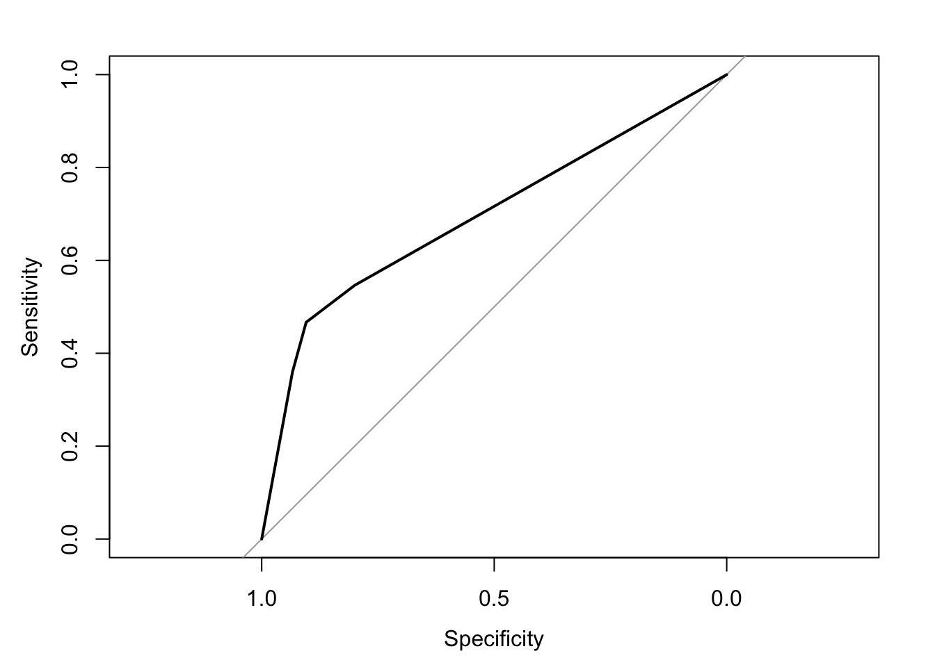
glmnet_ROC_rwe_training$auc # training set cross-validated AUC## Area under the curve: 0.6954coef_glmnet_rwe_training## 4 x 1 sparse Matrix of class "dgCMatrix"
## 1
## (Intercept) -1.900132655
## (Intercept) .
## appused app -0.001874018
## raceWhite -0.003428336We’ll select app regardless of its coefficient size because it is our potenial intervention. Still, we note that an automated search for important predictors ranked by coefficient size would have ranked race higher than app. We wonder how such a procedure could potentially have excluded true causes with smaller coefficients from other analyses we’ve done—causes that were important for recommending courses of action.
Importantly, note that the area under the receiver operating characteristic (ROC) curve (AUC) is not particularly large even though there exists a true ATE of app usage on infection risk by design. We use the simulation parameters and models (see Appendix) to calculate this ATE as -0.031. (We’ll derive this calculation in Part 2.) This ATE is only modestly sized; hence the modest AUC.
“To explain or to predict?” These findings underscore the important points in (Shmueli, 2010) about the different objectives, procedures, and properties of prediction and explanation.
Implications for Explanatory Modeling
We decide to keep race in the final explanatory model due to its relatively large prediction coefficient, even after controlling for app.
Propose Explanatory Model
An explanatory model is a domain hypothesis comprised of a causal model and a statistical model.
We will validate or confirm the statistical model using our holdout data.
We cannot validate or confirm the causal model using only our RWE data (training or holdout). We’d need to conduct an experiment or RCT to do this, or provide evidence in favor of our proposed causal model from the scientific literature.
We can—and should!—clearly state the causal model we’re assuming to be true. This is a key piece of scientific communication: It helps the reader interpret and assess our findings correctly before taking further action.
To fit the explanatory statistical model with a desired level of statistical power and evidence, we also need to specify a sample size.
Causal Model
From our findings, we propose the following causal model, formalized as a directed acyclic graph (DAG) (Pearl, 2009):
- App Usage Infection
- Race Infection
- Race App Usage
DiagrammeR::grViz("
digraph causal {

  # Nodes
  node [shape = plaintext]
  Z [label = 'Race']
  X [label = 'App \n Usage']
  Y [label = 'Infection']

  # Edges
  edge [color = black,
        arrowhead = vee]
  rankdir = LR
  X -> Y
  Z -> X
  Z -> Y

  # Graph
  graph [overlap = true]
}")Here, race confounds the effect of app usage on infection.
Statistical Model and Sample Size
Based on our DAG, it makes sense to model the infection risk as a function of race and app usage. We propose the following logistic model.
glm_rwe_training <- glm(
  data = observational_rwe_training,
  formula = as.factor(infection) ~ app + race,
  family = "binomial"
)summary(glm_rwe_training)$coefficients## Estimate Std. Error z value Pr(>|z|)
## (Intercept) -0.2280908 0.02278461 -10.01074 1.367266e-23
## appused app -0.3432987 0.03249127 -10.56588 4.289439e-26
## raceWhite -1.9073638 0.03260492 -58.49926 0.000000e+00The estimated odds of infection for app users were -0.343 0.709 (95% : 0.666, 0.756) times that of non-users (regardless of race). The corresponding estimated infection risks for app usage by race are:
risk_didnt_use_app_black_training <- plogis(coef(glm_rwe_training) %*% c(1, 0, 0))
risk_used_app_black_training <- plogis(coef(glm_rwe_training) %*% c(1, 1, 0))
risk_didnt_use_app_white_training <- plogis(coef(glm_rwe_training) %*% c(1, 0, 1))
risk_used_app_white_training <- plogis(coef(glm_rwe_training) %*% c(1, 1, 1))- 0.443 for Blacks not using the app
- 0.361 for Blacks using the app
- 0.106 for Whites not using the app
- 0.077 for Whites using the app
In order to estimate the RD for Blacks with 80% statistical power at an overall level of statistical evidence, the required sample sizes are:
# https://cran.r-project.org/web/packages/pwr/vignettes/pwr-vignette.html
sample_size_black <- ceiling(
  pwr::pwr.2p.test(
    h = pwr::ES.h(p1 = risk_used_app_black_training, p2 = risk_didnt_use_app_black_training),
    sig.level = 0.05,
    power = .80,
    alternative = "less"
  )$n
)
sample_size_white <- ceiling(
  pwr::pwr.2p.test(
    h = pwr::ES.h(p1 = risk_used_app_white_training, p2 = risk_didnt_use_app_white_training),
    sig.level = 0.05,
    power = .80,
    alternative = "less"
  )$n
)- 556 Black individuals in each app usage group (i.e., users or non-users)
- 1617 White individuals in each app usage group
Note that these figures are for one-sided hypothesis tests that the infection risk is lower for app users versus non-users within each racial group. They adjust for multiple testing (i.e., multiple comparisons, multiplicity) by requiring each of the two individual statistical hypothesis tests to meet an level of statistical evidence.
Explanatory Modeling (Validation/Confirmation)
Recall that our holdout dataset has 16000 observations.
Infections by App Usage (Marginal Model)
Let’s first examine our main relationship of interest, as we did with the training data.
observational_rwe_holdout %>%
  ggplot2::ggplot(ggplot2::aes(x = app, fill = infection)) +
  ggplot2::theme_classic() +
  ggplot2::geom_bar(position = "dodge") +
  ggplot2::ggtitle("Infections by App Usage")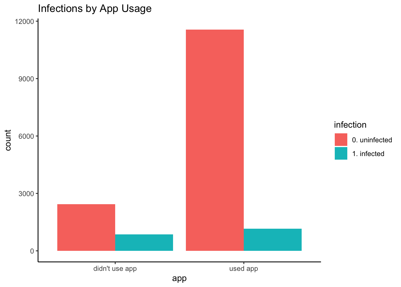
df_rwe_holdout <- with(
  observational_rwe_holdout,
  cbind(
    table(app, infection),
    prop.table(table(app, infection), margin = 1) # row proportions
  )
)
knitr::kable(df_rwe_holdout) # row proportions| 0. uninfected | 1. infected | 0. uninfected | 1. infected | |
|---|---|---|---|---|
| didn’t use app | 2433 | 854 | 0.7401886 | 0.2598114 |
| used app | 11563 | 1150 | 0.9095414 | 0.0904586 |
As before, there was a lower infection rate among app users: Only 9% of users had infections, compared to 26% of non-users. The holdout empirical RD is -0.169, similar to the training empirical RD of -0.186.
Explanatory Model
Check Sample Size
Do we have a large enough sample for each app usage and racial group combination to meet our statistical power and evidence requirements?
observational_rwe_holdout %>%
  ggplot2::ggplot(ggplot2::aes(x = race, fill = app)) +
  ggplot2::theme_classic() +
  ggplot2::geom_bar(position = "dodge") +
  ggplot2::ggtitle("App Usage by Race")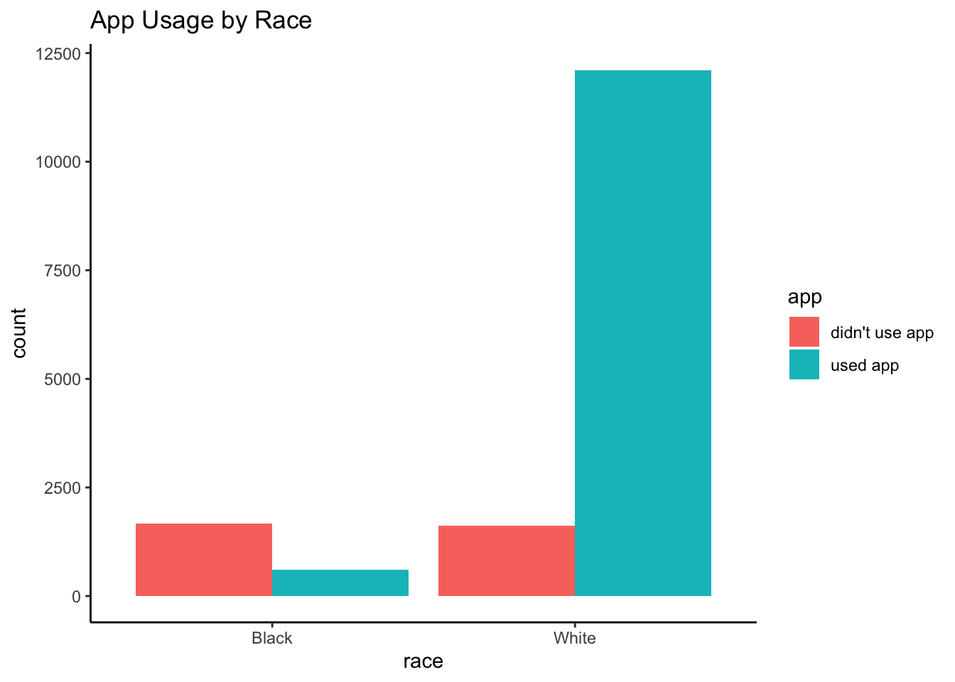
df_rwe_holdout_race_app <- with(
  observational_rwe_holdout,
  cbind(
    table(race, app),
    prop.table(table(race, app), margin = 1) # row proportions
  )
)
knitr::kable(df_rwe_holdout_race_app) # row proportions| didn’t use app | used app | didn’t use app | used app | |
|---|---|---|---|---|
| Black | 1667 | 607 | 0.7330695 | 0.2669305 |
| White | 1620 | 12106 | 0.1180242 | 0.8819758 |
Yes: We have at least 556 Black individuals in each app usage group, and at least 1617 White individuals likewise.
Fit Statistical Model
Based on our proposed causal and statistical models, we fit the following logistic model.
glm_rwe_holdout <- glm(
  data = observational_rwe_holdout,
  formula = as.factor(infection) ~ app + race,
  family = "binomial"
)summary(glm_rwe_holdout)$coefficients## Estimate Std. Error z value Pr(>|z|)
## (Intercept) -0.3220348 0.04608849 -6.987316 2.801938e-12
## appused app -0.2316567 0.06680031 -3.467899 5.245447e-04
## raceWhite -1.9344662 0.06675370 -28.979159 1.204740e-184After controlling for race, there is good statistical evidence (p < 0.001) for the estimated association between app usage and infection. This confirms our training-data findings. There is also very strong statistical evidence (p <<< 0.001) for race’s association with infection risk. Specifically, the estimated odds of infection for Whites were -1.934 0.145 (95% CI: 0.127, 0.165) times that of Blacks (regardless of app usage).
The estimated odds of infection for app users were -0.232 0.793 (95% CI: 0.696, 0.905) times that of non-users (regardless of race). The corresponding estimated infection risks for app usage by race are:
risk_didnt_use_app_black_holdout <- plogis(coef(glm_rwe_holdout) %*% c(1, 0, 0))
risk_used_app_black_holdout <- plogis(coef(glm_rwe_holdout) %*% c(1, 1, 0))
risk_didnt_use_app_white_holdout <- plogis(coef(glm_rwe_holdout) %*% c(1, 0, 1))
risk_used_app_white_holdout <- plogis(coef(glm_rwe_holdout) %*% c(1, 1, 1))- 0.42 for Blacks not using the app
- 0.365 for Blacks using the app
- 0.095 for Whites not using the app
- 0.077 for Whites using the app
The estimated RDs by race are:
rwe_holdout_rd_black <- risk_used_app_black_holdout - risk_didnt_use_app_black_holdout
rwe_holdout_rd_white <- risk_used_app_white_holdout - risk_didnt_use_app_white_holdout
confint_glm_rwe_holdout <- confint(glm_rwe_holdout) # 95% CIs: odds ratios of infection
rwe_holdout_rd_ci_black <- c(
  plogis(confint_glm_rwe_holdout[, 1] %*% c(1, 1, 0)) - plogis(confint_glm_rwe_holdout[, 1] %*% c(1, 0, 0)),
  plogis(confint_glm_rwe_holdout[, 2] %*% c(1, 1, 0)) - plogis(confint_glm_rwe_holdout[, 2] %*% c(1, 0, 0))
)
rwe_holdout_rd_ci_white <- c(
  plogis(confint_glm_rwe_holdout[, 1] %*% c(1, 1, 1)) - plogis(confint_glm_rwe_holdout[, 1] %*% c(1, 0, 1)),
  plogis(confint_glm_rwe_holdout[, 2] %*% c(1, 1, 1)) - plogis(confint_glm_rwe_holdout[, 2] %*% c(1, 0, 1))
)- -0.055 (95% CI: -0.083, -0.025) for Blacks
- -0.018 (95% CI: -0.022, -0.01) for Whites
Conclusion and Public Health Implications
How do we estimate the true ATE of -0.031?
Attempt 1: Holdout Empirical Risk Difference
Can we simply use the holdout empirical RD of -0.169 (i.e., a marginal quantity) as our ATE estimate?
In our synthetic data, race confounds the presumed effect of app usage on infection risk by design. The true bias of mistaking the holdout empirical RD to be an estimate of the ATE is exactly -0.169 -0.031 -0.138.
This highlights a crucial point:
Suppose we mistake this empirical RD as an estimate of the ATE. Unbeknownst to us, in our simulated world we would overstate our telemedicine app’s effectiveness by claiming it reduces the risk of new coronavirus infections by 16.9%—when in fact it will only reduce this risk by 3.1%.
Some public health implications are:
Health authorities will squander valuable weeks deploying our app and assessing its effectiveness. During this time, more promising solutions could have been implemented. More people will become newly infected, who could otherwise have been spared.
Hospitals, government agencies, and businesses will make plans incorrectly anticipating a 16.9% drop in infections.
Attempt 2: (To be continued…)
Can we somehow use our explanatory model to estimate the ATE? After all, we’d accounted for race as a confounder. Are either of our race-specific estimated RDs an estimate of the true ATE of -0.031? Unfortunately, no: The ATE is a risk difference averaged over all other variables. (It is a marginal—not conditional—quantity.)
So then, can we estimate the ATE as a weighted average of these estimated RDs? Fortunately, yes: The g-formula does exactly this, which we’ll learn about in Part 2. We’ll apply the g-formula to estimate the ATE—along with another popular method called propensity score weighting.
But first, in Part 2 we’ll see how an RCT allows us to estimate the ATE in a statistically consistent or unbiased way.
References
- Aubrey A. CDC Hospital Data Point To Racial Disparity In COVID-19 Cases. NPR. April 8, 2020 2:43 PM ET. npr.org/sections/coronavirus-live-updates/2020/04/08/830030932/cdc-hospital-data-point-to-racial-disparity-in-covid-19-cases
Garg S. Hospitalization Rates and Characteristics of Patients Hospitalized with Laboratory-Confirmed Coronavirus Disease 2019—COVID-NET, 14 States, March 1–30, 2020. MMWR. Morbidity and Mortality Weekly Report. 2020;69. cdc.gov/mmwr/volumes/69/wr/mm6915e3.htm
Hernán MA, Robins JM. Estimating causal effects from epidemiological data. Journal of Epidemiology & Community Health. 2006 Jul 1;60(7):578-86. jech.bmj.com/content/60/7/578.short
Pearl J. Causality. Cambridge university press; 2009 Sep 14. bayes.cs.ucla.edu/BOOK-2K/
Robins J. A new approach to causal inference in mortality studies with a sustained exposure period—application to control of the healthy worker survivor effect. Mathematical modelling. 1986 Jan 1;7(9-12):1393-512. sciencedirect.com/science/article/pii/0270025586900886
Rosenbaum PR, Rubin DB. The central role of the propensity score in observational studies for causal effects. Biometrika. 1983 Apr 1;70(1):41-55. academic.oup.com/biomet/article/70/1/41/240879
Smith A. Smartphone ownership-2013 update. Washington, DC: Pew Research Center; 2013 Jun 5. boletines.prisadigital.com/PIP_Smartphone_adoption_2013.pdf
Shmueli G. To explain or to predict?. Statistical science. 2010;25(3):289-310. projecteuclid.org/euclid.ss/1294167961
Appendix
RWE Simulation Parameters and Data-generation Models
Feature distribution
Race: Based on the U.S. Census, the probability of being White was set as 0.8560091.
Outcome Model
Partial Causal Model
Race and app usage both impact the infection risk. The partial DAG is:
- App Usage () Infection ()
- Race () Infection ()
DiagrammeR::grViz("
digraph causal {

  # Nodes
  node [shape = plaintext]
  X [label = 'App \n Usage \n (X)']
  Z [label = 'Race \n (Z)']
  Y [label = 'Infection \n (Y)']

  # Edges
  edge [color = black,
        arrowhead = vee]
  rankdir = LR
  X -> Y
  Z -> Y

  # Graph
  graph [overlap = true]
}")It’s partial because we haven’t yet specified how (if at all) app usage and race are associated.
Statistical Model
- The infection risk is lower for app users () versus non-users ().
- The infection risk is lower for Whites () versus Blacks () due to structural inequality (e.g., better access to care, higher SES, fewer underlying health conditions).
These statistical relationships are described by the logistic model where -0.2381882, -0.3, and -1.9469256. Hence, the probability of infection given race and app usage is
In particular, the infection risk is:
- 0.441 for Blacks not using the app
- 0.369 for Blacks using the app
- 0.101 for Whites not using the app
- 0.077 for Whites using the app
I chose these parameter values to reflect what was known as of 10 April 2020, as reported in a recent healthcare example involving racial disparities in COVID-19 cases (Garg et al, 2020; Aubrey, 2020) and this Washington Post article. The table emulated in the simulations is:
a <- round((1 - prInfectionGivenBlack) * prBlack, 3)
b <- round(prBlackGivenInfection * prInfection, 3)
c <- round((1 - prInfectionGivenWhite) * prWhite, 3)
d <- round(prWhiteGivenInfection * prInfection, 3)
knitr::kable(
  dplyr::tribble(
    ~Race, ~Uninfected, ~Infected, ~`Row Total`,
    "Black", a, b, a + b,
    "White", c, d, c + d,
    "Column Total", a + c, b + d, a + b + c + d
  )
)| Race | Uninfected | Infected | Row Total |
|---|---|---|---|
| Black | 0.081 | 0.063 | 0.144 |
| White | 0.769 | 0.087 | 0.856 |
| Column Total | 0.850 | 0.150 | 1.000 |
Propensity Model: App Usage
Partial Causal Model
Race affects app usage. For example, suppose our app is only available on iPhone, and that Blacks are less likely than Whites to own iPhones (e.g., page 7 of Smith, 2013). In addition, suppose African Americans have worse access to telemedicine services, and so tend to be less aware of such apps.
That is, the partial DAG is:
- Race () App Usage ()
DiagrammeR::grViz("
digraph causal {

  # Nodes
  node [shape = plaintext]
  Z [label = 'Race \n (Z)']
  X [label = 'App \n Usage \n (X)']

  # Edges
  edge [color = black,
        arrowhead = vee]
  rankdir = LR
  Z -> X

  # Graph
  graph [overlap = true]
}")Statistical Model
Whites are more likely to use the app than Blacks. This statistical relationship is described by the logistic model where -1 and 3. Hence, the probability of using the app given race is
In particular:
- 26.9% of Blacks use the app
- 88.1% of Whites use the app
Causal Model
The full DAG is:
- App Usage () Infection ()
- Race () Infection ()
- Race () App Usage ()
DiagrammeR::grViz("
digraph causal {

  # Nodes
  node [shape = plaintext]
  X [label = 'App \n Usage \n (X)']
  Z [label = 'Race \n (Z)']
  Y [label = 'Infection \n (Y)']

  # Edges
  edge [color = black,
        arrowhead = vee]
  rankdir = LR
  X -> Y
  Z -> Y
  Z -> X

  # Graph
  graph [overlap = true]
}")RWE Simulation R Code
##### Set simulation parameters


### Preliminaries
random_seed <- 2004101447
sample_size_observational <- 80000


### Feature distribution
piZ <- 0.755 / (0.755 + 0.127) # race (based on U.S. Census)


### Outcome model

# beta0 and betaZ are derived from:
#   https://www.cdc.gov/mmwr/volumes/69/wr/mm6915e3.htm
#   https://www.npr.org/sections/coronavirus-live-updates/2020/04/08/830030932/cdc-hospital-data-point-to-racial-disparity-in-covid-19-cases
#   https://www.washingtonpost.com/news/powerpost/paloma/the-health-202/2020/04/09/the-health-202-los-angeles-is-racing-to-discover-the-true-coronavirus-infection-rate/5e8de70588e0fa101a75e13d/

prInfection <- 0.15
prBlack <- 1 - piZ
prWhite <- piZ
prBlackGivenInfection <- 33 / (33 + 45)
prWhiteGivenInfection <- 1 - prBlackGivenInfection
prInfectionGivenBlack <- prBlackGivenInfection * prInfection / prBlack
prInfectionGivenWhite <- prWhiteGivenInfection * prInfection / prWhite

beta0 <- log(prInfectionGivenBlack / (1 - prInfectionGivenBlack)) # baseline: infection risk for Blacks who don't use app
betaX <- -0.3
betaZ <- log(prInfectionGivenWhite / (1 - prInfectionGivenWhite)) - beta0 # average influence of being White on infection risk


### Propensity model: app usage
alpha0_observational <- -1 # observational real-world evidence: baseline probability of using app for Blacks
alphaZ_observational <- 3 # observational real-world evidence: average influence of being White on probability of using app


##### Generate data.
set.seed(random_seed)
observational_rwe <- dplyr::tibble(
  race = rbinom(n = sample_size_observational, size = 1, prob = piZ),
  app = rbinom(n = sample_size_observational, size = 1, prob = plogis(alpha0_observational + alphaZ_observational * race)),
  infection = rbinom(n = sample_size_observational, size = 1, prob = plogis(beta0 + betaX * app + betaZ * race))
) %>%
  dplyr::mutate(
    race = ifelse(race == 1, "White", ifelse(race == 0, "Black", NA)),
    app = ifelse(app == 1, "used app", ifelse(app == 0, "didn't use app", NA)),
    infection = ifelse(infection == 1, "1. infected", ifelse(infection == 0, "0. uninfected", NA))
  )